.webp?width=700&height=400&name=2024%20Blog%20Images%20(1).webp)
In the technology world, it doesn’t matter what you’re building or who will use it; the user experience and interface are of utmost importance. If users can’t figure out how to navigate your product and/or don’t have a positive experience, they will never realize its full capabilities, and you will risk losing customers. In the BAS space, a poor interface ends up becoming a burden on your building’s efficiency and on engineers and system integrators as they have to constantly field questions from end users.
A good user interface, however, is designed to be flexible and can meet a varying amount of user needs and workflows. A good user interface is not only intuitive; it has the following elements: easy navigation, clean graphics, efficient screen layout, powerful widgets, interrelated applications, and a mobile-first strategy. So how do you accomplish that? By implementing these UI/UX best practices throughout your interface.
Making your system’s navigation as easy as possible is one of the best ways to improve your interface. Here are a few different approaches to that.
There are two basic types of navigation in a BAS: drill down and menu navigation. Traditionally, BAS user interfaces are uni-dimensional with drill-down navigation. There’s only one path to get to where you need to go, which means getting back home requires numerous back keystrokes or clicks. Not only is that inefficient, it’s also confusing because the user has no idea where they are in the navigation, or how to get back after they’ve drilled down a few levels.
For the system integrator, creating drill-down menus is labor intensive because it requires multiple configuration steps to add links to create the drill-down paths. In FIN, the drill-down navigation is created more efficiently through the use of graphic creation wizards. We have wizards for creating campus maps, building elevations, and floor plans that do much of the heavy lifting by creating the relationships that are used for the navigation.
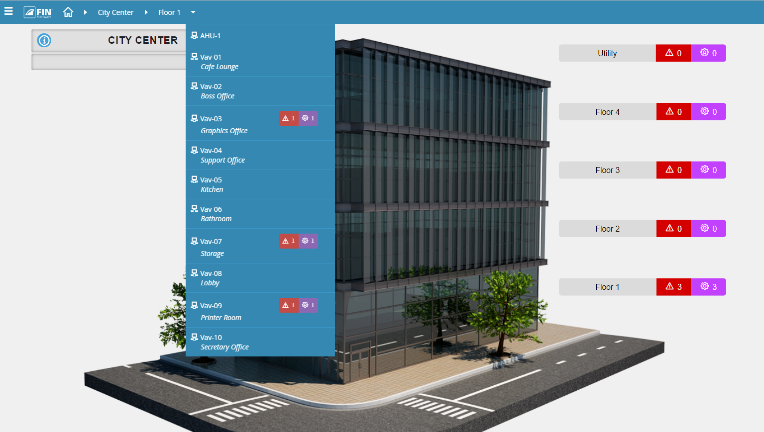
In menu navigation, your interface typically has a navigation bar comprised of sites, floors, and equipment arranged so that the user can drill down to the exact location with just a few mouse clicks. Menu navigations are much more intuitive and allow the user to see the bigger picture as they expand the dropdowns. This is a relatively new UX feature, however generally, menu navigation requires the System Integrator to build it from scratch.
In FIN, as you’re configuring your database of equipment, the software automatically builds the relationships, and those relationships are used to dynamically create the menu navigation instead of manually having to create a file that contains those things. Also, as changes are made to the database, such as adding a new floor or more equipment, the navigation dynamically updates.
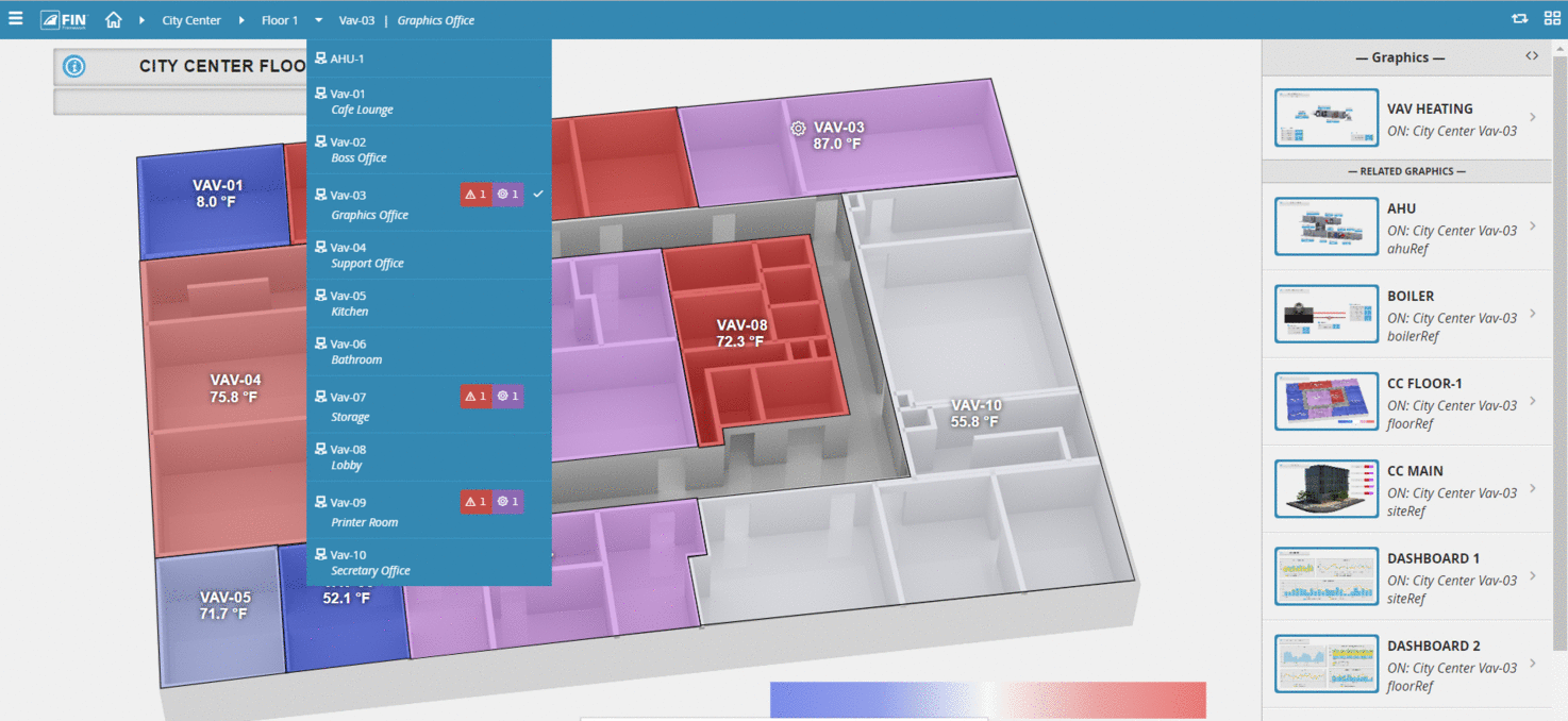
Another way to improve the navigation of your interface is by using thumbnail images to provide a way to navigate to a graphic. One way FIN uses thumbnails is to predict where a user might want to go based on the context they are in. For example, as you’re in a particular context like a custom graphic floor plan, other related graphics will automatically show up as thumbnails on the side panel, representing, for example, a link to the building or related dashboard. Those thumbnails are automatically generated and hyperlinked by the system application and do not require application engineering labor.
In FIN, we include additional information in the form of badges within the navigation and custom graphics. When you click on the badges, they open the associated application, such as the alarms and overrides app, in the sidebar. Everything you need associated with that related piece of equipment is right there. One of the nice things about badges is that they disappear when everything is normal. This reduces visual clutter and simplifies the user experience.
Numerous UX/UI studies will tell you that a clean interface is easier to navigate than one cluttered with links and buttons. This poses a problem for building automation systems as there is so much information to display. BAS graphics tend to be very complex to account for multiple navigation paths and applications. The navigation is typically hard-coded into a traditional graphic with multiple buttons and hyperlinks all over the screen. It creates a visually noisy user experience that reduces usability.
FIN has solved the problem of a messy interface with the creation of Magic Bubbles. Magic bubbles take care of all the hyperlinks to other applications by making them pop up so that they don’t litter the screen and then disappear when they are not in use.
Another UI best practice is the way in which information is organized and displayed on the page. Instead of having a single screen that displays everything a user may need on the page, a good user experience will utilize multiple zones. In FIN, you have the main screen, the menu navigation, and the sidebar. For example, when clicking on content in the main screen, the related application is displayed in the sidebar. The sidebar can effectively display any of the associated applications: schedules, overrides, notes, point graphics, and thumbnails. Compare this to other systems where you’re “turning the page” and losing your place as you navigate to the next graphic or application.
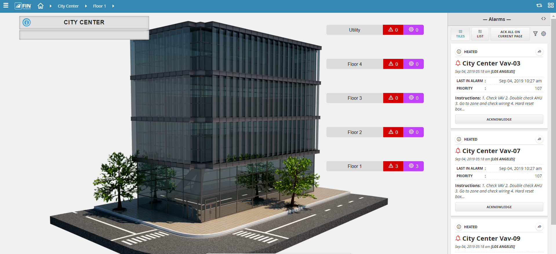
Another example of good navigation design is a powerful widget we call Magic Bubbles. As we mentioned before, instead of putting hyperlinks on the graphics and cluttering the interface, FIN has a system widget that pops up based on what has been selected on the screen. Based on the context of the selection, the related applications will change or populate. Similar to badges, hyperlinked icons of the related applications are auto-generated and when selected, launch the application in the sidebar zone.
Engineering Magic Bubbles couldn’t be simpler! They are automatically generated from the database relationship tags and don’t require the error prone, labor intensive linking.
In traditional BAS systems, there is only one pathway to your applications, which is a very limiting design from a user experience standpoint. A good UI has multiple pathways to access the system applications and gives the user context based on what they are looking at (building level, floor plan, and equipment graphics).
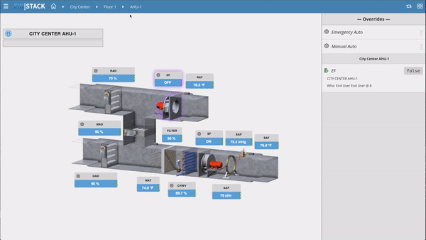
In FIN, an operator can navigate and select a piece of equipment that’s in alarm. For example, an end user is troubleshooting a hot temperature complaint. They might click on the floor plan to validate the temperature in question. From there, they can bring up the magic bubbles for that zone and see that it’s being managed by a major piece of equipment like an air handler. At the air handler, they can pull up a summary and check to see if other zones are having similar issues to see if it’s a system wide problem. This example illustrates how powerful interrelated applications can be: ad hoc navigating from alarms to floor plans to equipment to summaries. With just a few clicks, using FIN’s magic bubbles and related content, you can navigate applications and troubleshoot system issues easily.
Users demand mobile access for just about every technology they touch. Using software or websites that are not built with a mobile-first strategy often lack functionality and can be painful to navigate from a mobile device. Your interface should be built using responsive web design so that it automatically scales and formats to different-sized browsers, such as phones and tablets, without losing functionality along the way.
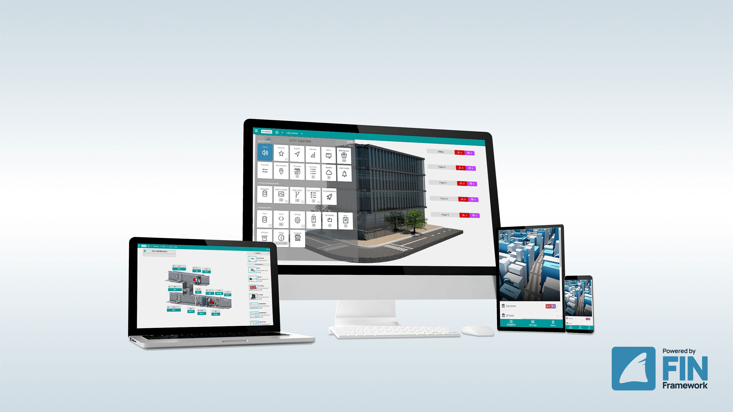
We’re all used to having multiple applications on our smartphones. The calendar app, contacts app, and email apps are all separate applications but are linked together to share related information. Conversely, traditional BAS has offered a limited set of features for mobile experiences through a single browser experience. FIN leverages a collection of apps similar to our smartphone and integrates them into a cohesive, flexible user experience. This means that all of the applications available in the desktop experience are also available in the mobile experience (Graphics, Schedules, Summaries, Alarms, Overrides, O&M Manuals, Weather, and Favorites).
Topics from this blog: End User FIN 5.0
Back to all posts